


Accordion
The accordion component is useful for when a brief string of text can describe a longer passage of text that is optional enough to be hidden by default.
This one is closed by default
Inside is some text that appears when you click/toggle the label.
But this one is open by default
The checkbox in the Settings tab lets you set this per accordion.
And another closed one
This is just for closure, rather than being a distinct state of accordion-ness. Imagine what this section would be like if there were just one open and one closed accordion!
What do accordions with the "Question and Answer" checkbox checked look like?
This! This is what they look like. This one is even expanded by default.
Block
The 'Block' flavor of component lets you insert system blocks. This is useful for dropping in social icons, forms for search and other listings, or filling in some blanks throughout the site when it comes to functionality other components don't handle. When in doubt, stay away from this component; it's used sparingly in day-to-day content entry.
Below is the social icons block:
Blockquote
The blockquote component allows you to show a quotation in a semantically-meaningful way in the HTML markup, and also makes the quotation stylized. It's best used in conjunction with a Heading component (set to regular text for semantics) as the byline below it, as illustrated below:
—Franklin D. RooseveltWhen you reach the end of your rope, tie a knot in it and hang on.
The blockquote component has Settings for the inclusion of the opening and closing quotes separately, with both checked to include them by default, in case you want have or not have the stylized marks. See below for a blockquote without marks.
—Amelia EarhartThe most difficult thing is the decision to act, the rest is merely tenacity. The fears are paper tigers. You can do anything you decide to do. You can act to change and control your life; and the procedure, the process is its own reward.
Finally, here's a very long quote with opening and closing quote marks, demonstrating the placement of the closing mark.
Blockquote can contain non-paragraph text.
Lorem ipsum dolor sit amet, sit verear bonorum fabellas ea, ea autem invidunt has. Pri at tibique ocurreret. Sea populo signiferumque necessitatibus cu, cum eu erat debitis. Ex odio quando torquatos nec, te his noluisse singulis consequat. Ius in zril officiis ocurreret.
Id aliquid oportere nec. Eu duo adipisci dissentiet ullamcorper, pro eu nobis partiendo definitiones, habemus commune prodesset pro ad. Ius saperet ancillae id, nec apeirian conclusionemque an, te vis conceptam complectitur. Ut pri facer denique consectetuer, ius no modus petentium efficiantur, sit putant postulant ne. Graece eripuit vel ei. Nec an ocurreret mnesarchum, duo cu propriae gubergren theophrastus, per probo iudicabit id.
Vis nemore putant eu, eam volumus expetenda ne. Albucius consetetur vituperata sit cu. Ad sit odio maluisset. Prima blandit no sea. Iudico invenire consequuntur eu cum. Ex nam delectus accommodare intellegebat, scaevola explicari cu vel.
Copiosae quaerendum has at. Ne odio delicatissimi mea, homero veritus appellantur cum id, ne mel impetus salutatus. Ad mundi oporteat sit, sea ea inani dolore integre. Id timeam appetere lucilius vix, tritani detracto pericula qui ei, omnis dissentiunt ei eum.
Ex has voluptua recusabo qualisque. Vero petentium nam te. In iisque nominavi consequat pro. Est an civibus nominati, sea ei commodo detraxit repudiare, esse clita impetus eum no. Novum dolore nec ex, maiorum omnesque deserunt mei ei, veniam mucius omittam est an.
This blockquote ends with a code tag, just to throw a wrench in the works.
Cards
Cards are bite-sized, reusable pieces of content that you can place all over the site. They're an optional image, title, some text, and an optional link. They appear styllized and side-by-side, but can be developed to appear in all kinds of ways.
Below, cards appear side-by-side.


Card with no link
This is some text for card #2.
Card with no image
This card has a title, text, and a link, but no image. It shows what cards look like and their vertical alignment because variation is so allowable in the system.
SymTechCards can also appear in carousels, as shown below.

Newspaper (card 1, carousel)
Here is some text for the carousel #1 card.

Brad (card #2)
Here's Brad.
More blocks
We used blocks in the first set of cards, too. This one is different (though the image is the same).
And a security camera
This is used as the hero background for the default Privacy Policy page.
Privacy PolicySolutions card carousel
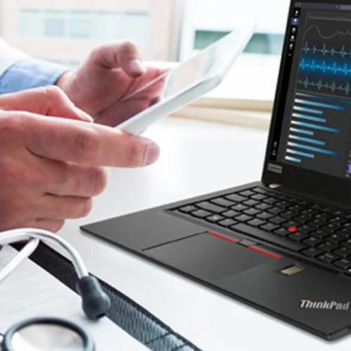
Lenovo: Solving Workflow, Safety and Security Challenges
WAVE ID® Embedded OEM readers directly integrate into healthcare-optimized laptops, provide single sign-on access to health records while ensuring compliance and improving the productivity of 1,800 providers serving 1.9 million people.
Read Case Study
Imprivata: How Healthcare Security Should Work
Clinicians enter passwords to access secure workstations and applications 70 times daily, on average. Imprivata’s OneSign® authentication solution provides tap-and-go access, saving valuable time while vastly improving security.
Read the Case Study
Wamee: Protecting Patient and Staff Safety
Cleaning keyboards for infection-control purposes can be a time-consuming challenge. This sleek, washable keyboard with an embedded credential reader is enhancing safety while improving productivity for clinicians and the cleaning staff.
Read the Case Study
World Wide Technology: Simplifying Employee Health Screening
With the pandemic in full swing, a major healthcare organization needed a way to screen its employees for possible symptoms to help ensure patient safety. The solution went from idea to deployment in just four weeks.
Read the Case Study
Lenovo: Solving Workflow, Safety and Security Challenges
WAVE ID® Embedded OEM readers directly integrate into healthcare-optimized laptops, provide single sign-on access to health records while ensuring compliance and improving the productivity of 1,800 providers serving 1.9 million people.
Read Case Study
Imprivata: How Healthcare Security Should Work
Clinicians enter passwords to access secure workstations and applications 70 times daily, on average. Imprivata’s OneSign® authentication solution provides tap-and-go access, saving valuable time while vastly improving security.
Read the Case Study
Wamee: Protecting Patient and Staff Safety
Cleaning keyboards for infection-control purposes can be a time-consuming challenge. This sleek, washable keyboard with an embedded credential reader is enhancing safety while improving productivity for clinicians and the cleaning staff.
Read the Case Study
World Wide Technology: Simplifying Employee Health Screening
With the pandemic in full swing, a major healthcare organization needed a way to screen its employees for possible symptoms to help ensure patient safety. The solution went from idea to deployment in just four weeks.
Read the Case StudyContent Listing
The content listing special type lets you show snippets of other content on the site, whether it be news articles, events, services, service categories, industries, or others. You can mix and match them. And with the settings you can choose how they're laid out and whether to show a larger teaser or a small chiclet.
Below is side-by-side listing of teasers for various content types:
Below is the same content as above, side-by-side, but now it's the small display mode. Smalls tend to all be little boxes with just a little text and maybe an icon or thumbnail:
Here's the same content again, but with the teasers displaying vertically in the single column layout:
The third layout option for content is a slideshow/carousel. It displays three items and advances by one. Below is the same content plus some friends in teaser form, styled as a carousel.
Heading
The heading component inserts HTML <h*> tags and allows for styling. See below for the base heading type scale, as compared against this body text:
Heading level 1
Heading level 2
Heading level 3
Heading level 4
Heading level 5
Heading level 6
Heading (regular text, span)Headings have a number of optional settings:
- Font weight
- Size - any heading level can look like any other heading level
- Text color - full suite of colors from the theme
- Text transform - take regular-case text and style it as ALL-CAPS or other casing
Below is a heading level 2 styled to look like a heading level 3 with a color.
Looks like a heading 3, doesn't it?
Below is heading level 2 with all the theme colors:
Dark (inherit)
Black
Grey (dark)
Grey
Grey (light)
White
Main
Main (dark)
Main (light)
Second
Second (dark)
Second (light)
Third
Third (dark)
Third (light)
Accent
iframe
The iframe component lets you insert content from other sites. This component should be used sparingly, as iframes are unpredictable and don't work very well on mobile.
Here's an example iframe:
Layout
What's cool about layouts is that you can mix and match all the other components on this page, and place them into logical layouts of infinite configurability.
The way you do that is by making a Layout component (a 'row') and then placing columns within it. The Layout row only has two options:
- Column spacing - what to do with any remaining space between columns, which is rare
- Reverse? - Allowing you to make a row appear in reverse order for creating alternating rows
Each column has a lot more Settings:
- Animate - whether you want an animation to reveal the column as a user scrolls down to it
- Animation type - A bunch of effects to choose from that activate when you click the Animate checkbox
- Background color - Theme colors you can use to add some color to the column
- Padding (horizontal) - How much left-right space to introduce to either side of the content
- Text alignment - Left/Right/Center/Justified text within the column
- Text color - either Dark or light, depending on the background color you choose
- Vertical alignment - how you want the content of the column to align with content in other columns
- Width - the relative width of the column compared to the others. If you make a Small column and a medium column in a layout row, the result will be a 1/3-2/3 layout, which is pretty common
Here's that very layout for your testing.
A common use case for layouts is that one column will be empty, while the other has content in it. In these cases, there's usually a background image that takes up the empty space, and it disappears or becomes less-usefully smaller on tablet and mobile. For these layouts, the empty column (a column containing only one spacer) will disappear entirely when you get to mobile view.
Link
The Link component lets you enter links in a way that helps preserve paths on the site (in case the URLs for pages change, the links will auto-update). It also has a couple Settings that allow you to display links as buttons.
Here's a link as it displays by default:
And here's a link rendered as a button in a theme color:
Here's all the buttons in theme colors:
Media
The media component lets you enter images, videos, video embeds, audio, and documents. Below I will insert an image with a caption and hotspots:
Brad Czerniak made a lot of the base-level components in this system.
Brad has a nosering. No, not really.
As you can see, the image is really big. Images are responsive on this site, so inserting the same image into a layout causes it to be constrained. You can also upload smaller images and they will max out at their natural width.
And this is a video embed from YouTube:
Video caption
Do video hotspots work? This should be in the bottom left corner.
Rich text
This is rich text. It's a WYSIWYG that can take a bunch of text of your choosing.
Lorem ipsum, or lipsum as it is sometimes known, is dummy text used in laying out print, graphic or web designs. The passage is attributed to an unknown typesetter in the 15th century who is thought to have scrambled parts of Cicero's De Finibus Bonorum et Malorum for use in a type specimen book.
The rich text WYSIWYG includes the ability to include bold text, as well as italic text, superscriptssquared, plus subscriptsbelow.
You can insert horizontal rules:
And within the text you can add links, though this is surprisingly rare in this design system.
Additionally, you can add bulleted lists:
- First
- Second
- Third
Plus! Here's a numbered list:
- One
- Two
- Three
The WYSIWYG also includes some utility buttons, including one to insert symbols like ♦.
Spacer
The spacer component lets you put vertical breathing room between other components in a consistent manner. Below is an example of the 32x spacer, the biggest one available. There should be a lot of empty space below this text.
Stripe
Stripes have a bunch of options, and this stripe has lots of them selected.
- Background color — Theme colors you can set. If you use a background image, please set a color that similar to the darkness of the image being used
- Background image — Reusable images that appear as the background
- Background image alignment (horizontal) — A focal point horizontally
- Background image alignment (vertical) — Focal point vertically in image
- Background repeat — If you use a tiny image, you can tile it as a pattern
- Background sizing — Usually fill the whole area. Can also do tricky things
- Full width — Eliminate the maximum content area width, and have the stripe go all the way to the screen edges on big screens
- Hide background image on mobile — If the background image is 'busy', hide it on narrow screens
- Text alignment — Left, right, center, justify. Please never use justify
- Text color — Light or dark. Please match it to the background color you choose (the one that matches the darkness of any background images used)
- Unpad — Remove the top and bottom padding from the stripe so it's short and has less breathing room
We hope you enjoy this stripey system as much as we enjoyed making it!
Table
The Table component lets you insert semantic data tables on the site. Only simple numeric and plain-text data is allowed in the tables, so as to avoid using tables in an unsemantic manner. As we'll see, this limitation is also a way to allow us to make cool charts!
Here's a plain table of data that we'll reuse a bunch of times thereafter:
| Breakfast | Column 1 | Column 2 | Column 3 | Column 4 |
|---|---|---|---|---|
| Pop tarts | 10 | 4 | 4 | 6 |
| Cheerios | 7 | 9 | 1 | 3 |
| English muffin | 2 | 2 | 8 | 6 |
| Honeydew | 4 | 7 | 5 | 3 |
We can display table data (with some limitations) as a few different chart types:
- Bar
- Column
- Pie
- Line
- Stacked
...along with some additional options like labels and replacing the table with the chart.
Here's the breakfast table with a bar chart:
Here's a vertical bar (column) chart, using the same data as the horizontal one, though you can't see because we hide the table and just represent the data as a chart visually:
Here's a pie chart. Notice that we're only using one column of numbers; we can actually put in more, but the chart looks weird if you do that. Charts are fault-tolerant, but are best when the right data is entered:
| Breakfast | Column 1 |
|---|---|
| Pop tarts | 10 |
| Cheerios | 7 |
| English muffin | 2 |
| Honeydew | 4 |
| Cantelope | 6 |
| Granola | 12 |
| Banana | 2 |
| Oatmeal | 4 |
| Grapefruit | 6 |
Here's a line graph of the original data:
| Breakfast | Column 1 | Column 2 | Column 3 | Column 4 |
|---|---|---|---|---|
| Pop tarts | 10 | 4 | 4 | 6 |
| Cheerios | 7 | 9 | 1 | 3 |
| English muffin | 2 | 2 | 8 | 6 |
| Honeydew | 4 | 7 | 5 | 3 |
And here's a stacked chart of the original data:
| Breakfast | Column 1 | Column 2 | Column 3 | Column 4 |
|---|---|---|---|---|
| Pop tarts | 10 | 4 | 4 | 6 |
| Cheerios | 7 | 9 | 1 | 3 |
| English muffin | 2 | 2 | 8 | 6 |
| Honeydew | 4 | 7 | 5 | 3 |
Term listing
A Term listing component works just like a Content or User listing component (and honestly, just like Cards too) -- you choose or create some content, in this case tags and terms, and lay it out side-by-side or in a carousel.
User listing
A User listing lets you add in biographies just like all the other "listing" components. See the example below:
View
The View Special component lets you insert listings and dynamic content areas. Typically this sort of content would be built by the developer, and often placed by a developer as well. Only insert views if you are confident in what you are doing.
Below is an example view:
Webform
The Webform special is the way to insert forms on the site. First you make the form from the webforms section of the admin screens, then select the form you want when making the component.
What's Happening

Video
This is a caption. This is a caption. This is a caption. This is a caption. This is a caption. This is a caption. This is a caption. This is a caption. This is a caption. This is a caption. This is a caption. This is a caption.